Jon Schwabish
I recently published "Ten Guidelines for Better Tables" in the Journal of Benefit Cost Analysis (@benefitcost) on ways to improve your data tables.
— Jon Schwabish (@jschwabish) August 3, 2020
Here's a thread summarizing the 10 guidelines.
Full paper is here: https://t.co/VSGYnfg7iP pic.twitter.com/W6qbsktioL
After seeing Jon’s Twitter thread, I asked him if I could adapt the examples over to R. He graciously agreed, so I’ve gone ahead and adapted some examples from his 10 Guidelines article 1 below in the R package gt. Jon also has a Better Data Visualizations book coming out in Jan 2021 - check it out at Columbia University Press.
1 https://www.cambridge.org/core/journals/journal-of-benefit-cost-analysis/article/ten-guidelines-for-better-tables/74C6FD9FEB12038A52A95B9FBCA05A12
Please note that the 10 Guidelines section headers are quoted verbatim from Jon’s article (after asking permission), while the tables themselves and text descriptions are original content inspired from his work.
10 Rules for Tables
- Twitter Thread - In this thread, Jon covers the highpoints of each of the 10 guidelines
- 10 Guidelines in the Journal of Benefit Cost Analysis - In this article, Jon dives even deeper into the WHY and longer explanations of the guidelines, along with some best practice examples
Cole Nussbaumer Knaflic
The Storytelling with Data community (#SWDchallenge) is hosting a “Build a Table” challenge for September 2020. Check out the resources below and try your hand to create some beautiful tables!
Find some data of interest that will lend itself well and create and share a table.
Share your creation in the SWD community by September 30th at 5PM PDT. If there is any specific feedback or input that you would find helpful, include that detail in your commentary.
Stephen Few
I also have some overview examples from Stephen Few’s book Show Me the Numbers: Designing Tables and Graphs to Enlighten. In my opinion, Stephen Few’s Show Me the Numbers 2 is one of the best if not the best general books on both data visualization and data tables. There are more recent books on data viz, but very few address tables at all, much less with the depth that Few does! I am barely scratching the surface of what Stephen and Jon cover - so make sure to check out their resources!
2 http://www.stephen-few.com/smtn.php
Few summarizes the difference between Tables and Graphs:
> Tables: Display used to look up and compare individual values
> Graphs: Display used to reveal relationships among whole sets of values and their overall shape
When to use each
He further suggests when to use which format:
| Use Tables When | Use Graphs When |
|---|---|
|
|
|
|
|
|
|
|
|
|
| Adapted from: Few, Stephen. (2012). Show Me the Numbers: Designing Tables and Graphs to Enlighten.(4)57 |
|
This table thus separates Data Viz and Data Tables into their specific purposes, however like most rules you can bend these with creative use.
Taxonomy of table uses
While that’s helpful, I also think that his taxonomy of the Primary Function, Relationship Type, and Relationship are extremely useful for determining the purpose of your table. Similar to data viz it’s all too easy to simply throw data into a table and not think about how to improve its function. I’ve adapted his taxonomy and added my own examples with the #TidyTuesday dataset from week 36 of 2020.
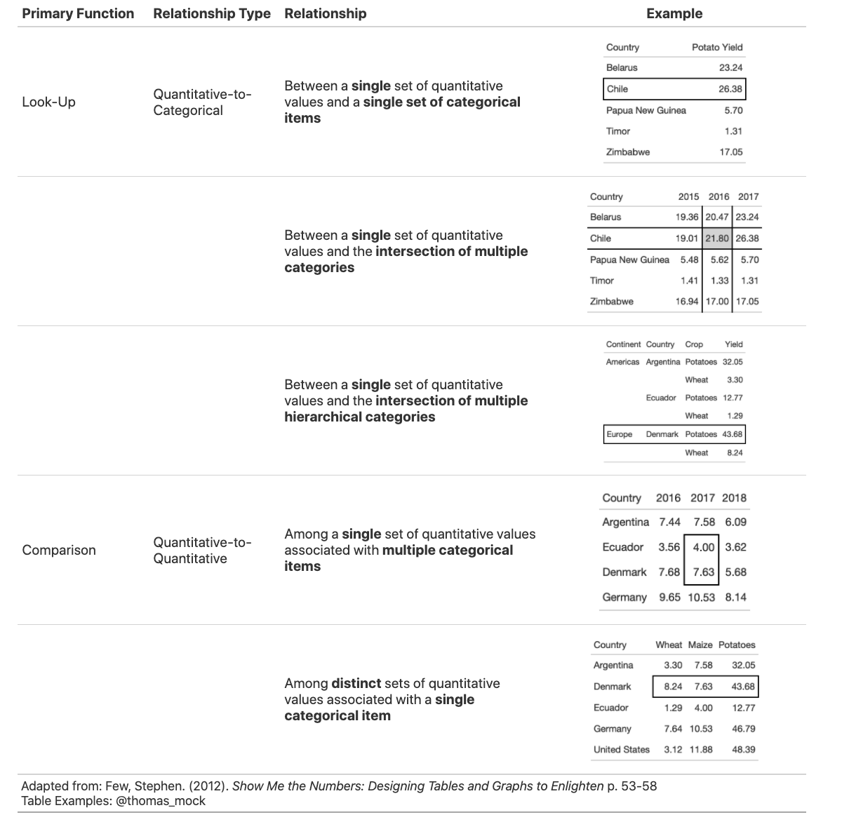
With this taxonomy you can specifically choose what you purpose/function you are giving the table. Again, it’s important to not just throw data into a tabular format and call it a day, but rather make specific design decisions to help guide the reader towards the purpose of the table. All too often we do all the heavy lifting to clean, summarize, and model the data only to let our readers down by not preparing a useful final data product.
We should be making conscious decisions:
- What is the Primary Function of this table?
- How is the data related?
- How can I best present the data relationships to accomplish the primary function?
- Can I improve the readability?
- Can I reduce repetition?
- Can I guide the reader to use the table in a better way?
gt: A Grammar of Tables
gt is again, an R package to create tables in R. It provides a Grammar of Tables to turn tabular data into a proper table!
While gt is fantastic, I also greatly enjoy other table packages in R:
- kableExtra - great for HTML/LaTex
- formattable - great for custom fill of cells and HTML
- DT or reactable - great for reactive tables
- flextable - A very useful package for Word-based tables
Additionally - if your primary output is model summaries rather than data tables, make sure to check out the wonderful gtsummary R package which extends the gt package for statistical model summaries. Note that while it uses gt, it also further supports kable, kableExtra, flextable (for Word docs), and tibble methods.
The “grammar” of tables can be seen below.

With this as our starting point, we can use code to add specific portions and change the overall structure and appearance of the tables.
Basic gt Table
You can create a table by passing in data to gt(), and the idea is that you progressively add layers/changes to the gt table via the pipe.
# This works!
# gt(yield_data_wide)

# pipe also works!
yield_data_wide %>%
gt()| Country | crop | 2014 | 2015 | 2016 |
|---|---|---|---|---|
| China | maize | 5.8091 | 5.8929 | 5.9667 |
| China | potatoes | 17.1416 | 17.2684 | 17.6866 |
| India | maize | 2.6107 | 2.5972 | 2.6162 |
| India | potatoes | 22.9224 | 23.1257 | 20.5087 |
| Indonesia | maize | 4.9540 | 5.1784 | 5.3052 |
| Indonesia | potatoes | 17.6668 | 18.2027 | 18.2549 |
| Mexico | maize | 3.2964 | 3.4782 | 3.7180 |
| Mexico | potatoes | 27.3384 | 27.1435 | 27.9260 |
| Pakistan | maize | 4.3211 | 4.4248 | 4.5491 |
| Pakistan | potatoes | 18.1506 | 23.4439 | 22.4346 |
| United States | maize | 10.7326 | 10.5723 | 11.7433 |
| United States | potatoes | 47.1507 | 46.9000 | 48.6408 |
Add Groups
You can “split” a table intro groups by passes a grouped tibble…
yield_data_wide %>%
  head() %>%
  group_by(Country) %>% # respects grouping from dplyr
gt(rowname_col = "crop") | 2014 | 2015 | 2016 | |
|---|---|---|---|
| China | |||
| maize | 5.8091 | 5.8929 | 5.9667 |
| potatoes | 17.1416 | 17.2684 | 17.6866 |
| India | |||
| maize | 2.6107 | 2.5972 | 2.6162 |
| potatoes | 22.9224 | 23.1257 | 20.5087 |
| Indonesia | |||
| maize | 4.9540 | 5.1784 | 5.3052 |
| potatoes | 17.6668 | 18.2027 | 18.2549 |
Or by adding it as an explicit argument within gt.
yield_data_wide %>%
  head() %>%
  gt(
    groupname_col = "crop",
    rowname_col = "Country"
) | 2014 | 2015 | 2016 | |
|---|---|---|---|
| maize | |||
| China | 5.8091 | 5.8929 | 5.9667 |
| India | 2.6107 | 2.5972 | 2.6162 |
| Indonesia | 4.9540 | 5.1784 | 5.3052 |
| potatoes | |||
| China | 17.1416 | 17.2684 | 17.6866 |
| India | 22.9224 | 23.1257 | 20.5087 |
| Indonesia | 17.6668 | 18.2027 | 18.2549 |
Groups are also useful for groupwise summary rows! Notice I’m also using fmt_number() to decrease the decimal point precision of the numbers. It will default to 2 decimal places, although you can specify whatever number of decimals you want. You may also notice that I referenced the columns by position in fmt_number(), but used tidy-eval w/ vars() in summary_rows(). You can always fall back to either method!
yield_data_wide %>%
  mutate(crop = str_to_title(crop)) %>%
  group_by(crop) %>%
  gt(
    rowname_col = "Country"
  ) %>%
  fmt_number(
    columns = 2:5, # reference cols by position
    decimals = 2 # decrease decimal places
    ) %>%
  summary_rows(
    groups = TRUE,
    columns = vars(`2014`, `2015`, `2016`), # reference cols by name
    fns = list(
      avg = ~mean(.), # add as many summary stats as you want!
      sd = ~sd(.)
    )
  )
Warning: `columns = vars(...)` has been deprecated in gt 0.3.0:
* please use `columns = c(...)` instead| 2014 | 2015 | 2016 | |
|---|---|---|---|
| Maize | |||
| China | 5.81 | 5.89 | 5.97 |
| India | 2.61 | 2.60 | 2.62 |
| Indonesia | 4.95 | 5.18 | 5.31 |
| Mexico | 3.30 | 3.48 | 3.72 |
| Pakistan | 4.32 | 4.42 | 4.55 |
| United States | 10.73 | 10.57 | 11.74 |
| avg | 5.29 | 5.36 | 5.65 |
| sd | 2.90 | 2.81 | 3.21 |
| Potatoes | |||
| China | 17.14 | 17.27 | 17.69 |
| India | 22.92 | 23.13 | 20.51 |
| Indonesia | 17.67 | 18.20 | 18.25 |
| Mexico | 27.34 | 27.14 | 27.93 |
| Pakistan | 18.15 | 23.44 | 22.43 |
| United States | 47.15 | 46.90 | 48.64 |
| avg | 25.06 | 26.01 | 25.91 |
| sd | 11.51 | 10.86 | 11.73 |
Add spanners
Table spanners can be added quickly with tab_spanner() and again use either position (column number) or + vars(name).
yield_data_wide %>%
head() %>%
gt(
groupname_col = "crop",
rowname_col = "Country"
) %>%
tab_spanner(
label = "Yield in Tonnes/Hectare",
columns = 2:5
)| Yield in Tonnes/Hectare | |||
|---|---|---|---|
| 2014 | 2015 | 2016 | |
| maize | |||
| China | 5.8091 | 5.8929 | 5.9667 |
| India | 2.6107 | 2.5972 | 2.6162 |
| Indonesia | 4.9540 | 5.1784 | 5.3052 |
| potatoes | |||
| China | 17.1416 | 17.2684 | 17.6866 |
| India | 22.9224 | 23.1257 | 20.5087 |
| Indonesia | 17.6668 | 18.2027 | 18.2549 |
Add notes and titles
Footnotes can be added with tab_footnote(). Note that this is our first use of the locations argument. Locations is used with things like cells_column_labels() or cells_body(), cells_summary() to offer very tight control of where to place certain changes. While you can still reference columns by position, note that I use 1:3 here instead of 2:5 since I’m referencing just the column labels. You can again use vars(name) instead of position.
yield_data_wide %>%
head() %>%
gt(
groupname_col = "crop",
rowname_col = "Country"
) %>%
tab_footnote(
footnote = "Yield in Tonnes/Hectare",
locations = cells_column_labels(
columns = 1:3 # note
)
)| 20141 | 2015 | 2016 | |
|---|---|---|---|
| maize | |||
| China | 5.8091 | 5.8929 | 5.9667 |
| India | 2.6107 | 2.5972 | 2.6162 |
| Indonesia | 4.9540 | 5.1784 | 5.3052 |
| potatoes | |||
| China | 17.1416 | 17.2684 | 17.6866 |
| India | 22.9224 | 23.1257 | 20.5087 |
| Indonesia | 17.6668 | 18.2027 | 18.2549 |
| 1 Yield in Tonnes/Hectare | |||
Adding a source_note()
yield_data_wide %>%
head() %>%
gt(
groupname_col = "crop",
rowname_col = "Country"
) %>%
tab_footnote(
footnote = "Yield in Tonnes/Hectare",
locations = cells_column_labels(
columns = 1:3 # note
)
) %>%
tab_source_note(source_note = "Data: OurWorldInData")| 20141 | 2015 | 2016 | |
|---|---|---|---|
| maize | |||
| China | 5.8091 | 5.8929 | 5.9667 |
| India | 2.6107 | 2.5972 | 2.6162 |
| Indonesia | 4.9540 | 5.1784 | 5.3052 |
| potatoes | |||
| China | 17.1416 | 17.2684 | 17.6866 |
| India | 22.9224 | 23.1257 | 20.5087 |
| Indonesia | 17.6668 | 18.2027 | 18.2549 |
| Data: OurWorldInData | |||
| 1 Yield in Tonnes/Hectare | |||
Adding a title or subtitle with tab_header() and notice that I used md() around the title and html() around subtitle to adjust their appearance. You can use these to parse those types of arbitrary code within a specific portion of the table.
yield_data_wide %>%
head() %>%
gt(
groupname_col = "crop",
rowname_col = "Country"
) %>%
tab_header(
title = md("**Crop Yields between 2014 and 2016**"),
subtitle = html("<em>Countries limited to Asia</em>")
)| Crop Yields between 2014 and 2016 | |||
|---|---|---|---|
| Countries limited to Asia | |||
| 2014 | 2015 | 2016 | |
| maize | |||
| China | 5.8091 | 5.8929 | 5.9667 |
| India | 2.6107 | 2.5972 | 2.6162 |
| Indonesia | 4.9540 | 5.1784 | 5.3052 |
| potatoes | |||
| China | 17.1416 | 17.2684 | 17.6866 |
| India | 22.9224 | 23.1257 | 20.5087 |
| Indonesia | 17.6668 | 18.2027 | 18.2549 |
Adjust appearance
You can customize large chunks of the table appearance all at once via tab_options(). The full reference to ALL the options you can customize are in the gt packagedown site.
yield_data_wide %>%
head() %>%
gt(
groupname_col = "crop",
rowname_col = "Country"
) %>%
tab_header(
title = "Crop Yields between 2014 and 2016",
subtitle = "Countries limited to Asia"
) %>%
tab_options(
heading.subtitle.font.size = 12,
heading.align = "left",
table.border.top.color = "black",
column_labels.border.bottom.color = "black",
column_labels.border.bottom.width= px(3),
)| Crop Yields between 2014 and 2016 | |||
|---|---|---|---|
| Countries limited to Asia | |||
| 2014 | 2015 | 2016 | |
| maize | |||
| China | 5.8091 | 5.8929 | 5.9667 |
| India | 2.6107 | 2.5972 | 2.6162 |
| Indonesia | 4.9540 | 5.1784 | 5.3052 |
| potatoes | |||
| China | 17.1416 | 17.2684 | 17.6866 |
| India | 22.9224 | 23.1257 | 20.5087 |
| Indonesia | 17.6668 | 18.2027 | 18.2549 |
Because gt is built up by a series of piped examples, you can also pass along additional changes/customization as a function almost like a ggplot2 theme! You’ll notice that it’s VERY easy and quick to build up the bulk of a gt table, but you can also spend 2-3x the amount of code to add all sorts of little tweaks and customizations. Saving some of these tweaks as a “theme” can save you lots of repeated code calls!
my_theme <- function(data) {
tab_options(
data = data,
heading.subtitle.font.size = 12,
heading.align = "left",
table.border.top.color = "black",
column_labels.border.bottom.color = "black",
column_labels.border.bottom.width= px(3),
)
}
yield_data_wide %>%
head() %>%
gt(
groupname_col = "crop",
rowname_col = "Country"
) %>%
tab_header(
title = "Crop Yields between 2014 and 2016",
subtitle = "Countries limited to Asia"
) %>%
my_theme()| Crop Yields between 2014 and 2016 | |||
|---|---|---|---|
| Countries limited to Asia | |||
| 2014 | 2015 | 2016 | |
| maize | |||
| China | 5.8091 | 5.8929 | 5.9667 |
| India | 2.6107 | 2.5972 | 2.6162 |
| Indonesia | 4.9540 | 5.1784 | 5.3052 |
| potatoes | |||
| China | 17.1416 | 17.2684 | 17.6866 |
| India | 22.9224 | 23.1257 | 20.5087 |
| Indonesia | 17.6668 | 18.2027 | 18.2549 |
If you want to style values or a specific cell, you’ll want to use tab_style(), note that you can reference specific types of changes in the style, and by wrapping it in a list as seen below you can make multiple changes at a time. You are limited to one set of locations however.
Locations can take column/row by position (eg columns = 1, rows = c(5:6)) or with columns by name via vars(col_name). Lastly, you can use logical expressions in rows = to match certain criteria to assign a style. Here I’m assigning red italics to China’s crop outputs only with the following code: rows = Country == "China".
yield_data_wide %>%
head() %>%
gt() %>%
tab_style(
style = list(
cell_text(weight = "bold")
),
locations = cells_column_labels(everything())
) %>%
tab_style(
style = list(
cell_fill(color = "black", alpha = 0.2),
cell_borders(
side = c("left", "right"),
color = "black",
weight = px(2)
)
),
locations = cells_body(
columns = vars(crop)
)
) %>%
tab_style(
style = list(
cell_text(color = "red", style = "italic")
),
locations = cells_body(
columns = 3:5,
rows = Country == "China"
)
) Warning: `columns = vars(...)` has been deprecated in gt 0.3.0:
* please use `columns = c(...)` instead| Country | crop | 2014 | 2015 | 2016 |
|---|---|---|---|---|
| China | maize | 5.8091 | 5.8929 | 5.9667 |
| China | potatoes | 17.1416 | 17.2684 | 17.6866 |
| India | maize | 2.6107 | 2.5972 | 2.6162 |
| India | potatoes | 22.9224 | 23.1257 | 20.5087 |
| Indonesia | maize | 4.9540 | 5.1784 | 5.3052 |
| Indonesia | potatoes | 17.6668 | 18.2027 | 18.2549 |
If you want to do more of a dataviz style color gradient rather than assigning colors one at a time, you can use data_color() along with something like scales::col_numeric(). Note that I’m using paletteer to provide the palette, but you can also provide your own palette. Also - domain could be specified for a specific range, otherwise it will fit the colors to whatever range is present in the data.
yield_data_wide %>%
head() %>%
gt(
groupname_col = "crop",
rowname_col = "Country"
) %>%
data_color(
columns = vars(`2014`, `2015`, `2016`),
colors = scales::col_numeric(
paletteer::paletteer_d(
palette = "ggsci::red_material") %>% as.character(),
domain = NULL
)
)Warning: `columns = vars(...)` has been deprecated in gt 0.3.0:
* please use `columns = c(...)` instead| 2014 | 2015 | 2016 | |
|---|---|---|---|
| maize | |||
| China | 5.8091 | 5.8929 | 5.9667 |
| India | 2.6107 | 2.5972 | 2.6162 |
| Indonesia | 4.9540 | 5.1784 | 5.3052 |
| potatoes | |||
| China | 17.1416 | 17.2684 | 17.6866 |
| India | 22.9224 | 23.1257 | 20.5087 |
| Indonesia | 17.6668 | 18.2027 | 18.2549 |
Here we create our own palette with just a vector of color names (could also be a vector of hex colors). You can see now that the red is dark enough that gt automatically changes the colors of the text to better contrast. You can turn this feature off with autocolor_text = FALSE
yield_data_wide %>%
head() %>%
gt(
groupname_col = "crop",
rowname_col = "Country"
) %>%
data_color(
columns = vars(`2014`, `2015`, `2016`),
colors = scales::col_numeric(
c("white", "pink", "red"),
domain = NULL
)
)Warning: `columns = vars(...)` has been deprecated in gt 0.3.0:
* please use `columns = c(...)` instead| 2014 | 2015 | 2016 | |
|---|---|---|---|
| maize | |||
| China | 5.8091 | 5.8929 | 5.9667 |
| India | 2.6107 | 2.5972 | 2.6162 |
| Indonesia | 4.9540 | 5.1784 | 5.3052 |
| potatoes | |||
| China | 17.1416 | 17.2684 | 17.6866 |
| India | 22.9224 | 23.1257 | 20.5087 |
| Indonesia | 17.6668 | 18.2027 | 18.2549 |
That’s it for the basics of gt! Now, let’s dive into Jon Schwabish’s “10 Guidelines for Better Tables” where we can apply some of these techniques to some table examples.
10 Guidelines with gt
The core data comes from #TidyTuesday week 36 of 2020. Let’s load up the data and clean it up a bit. We’ll be using portions of this data throughout.
country_sel <- c("China", "India", "United States", "Indonesia", "Mexico", "Pakistan")
yield_data <- tuesdata$key_crop_yields %>%
janitor::clean_names() %>%
rename_with(~str_remove(., "_tonnes_per_hectare")) %>%
select(entity:beans, -code) %>%
pivot_longer(cols = wheat:beans, names_to = "crop", values_to = "yield") %>%
rename(Country = entity)Rule 1: Offset the Heads from the Body
The goal here is to clearly separate your column titles from the body of the table. Typically bold face, separator lines indicate categories/labels (column titles) from values (table body).
First we can prep the data to align with the examples.
1. Poor Example
Rule 1 | Poor example gt code
potato_tb <- potato_data %>%
gt() %>%
cols_hide(vars(crop)) %>%
opt_table_lines(extent = "none") %>%
fmt_number(
columns = 3:6,
decimals = 2
)Warning: `columns = vars(...)` has been deprecated in gt 0.3.0:
* please use `columns = c(...)` insteadpotato_tb| Country | 2013 | 2014 | 2015 | 2016 |
|---|---|---|---|---|
| China | 17.09 | 17.14 | 17.27 | 17.69 |
| India | 22.76 | 22.92 | 23.13 | 20.51 |
| Indonesia | 16.02 | 17.67 | 18.20 | 18.25 |
| Mexico | 26.78 | 27.34 | 27.14 | 27.93 |
| Pakistan | 21.81 | 18.15 | 23.44 | 22.43 |
| United States | 46.36 | 47.15 | 46.90 | 48.64 |
1. Improved Example
Rule 1 | Improved gt code
rule1_good <- potato_tb %>%
tab_style(
style = list(
cell_text(weight = "bold")
),
locations = cells_column_labels(everything())
) %>%
opt_table_lines(extent = "default") %>%
tab_options(
column_labels.border.top.color = "white",
column_labels.border.top.width = px(3),
column_labels.border.bottom.color = "black",
table_body.hlines.color = "white",
table.border.bottom.color = "white",
table.border.bottom.width = px(3)
) %>% tab_source_note(md("**Table**: @thomas_mock | **Data**: OurWorldInData.org<br>**Inspiration**: @jschwabish"))rule1_good| Country | 2013 | 2014 | 2015 | 2016 |
|---|---|---|---|---|
| China | 17.09 | 17.14 | 17.27 | 17.69 |
| India | 22.76 | 22.92 | 23.13 | 20.51 |
| Indonesia | 16.02 | 17.67 | 18.20 | 18.25 |
| Mexico | 26.78 | 27.34 | 27.14 | 27.93 |
| Pakistan | 21.81 | 18.15 | 23.44 | 22.43 |
| United States | 46.36 | 47.15 | 46.90 | 48.64 |
|
Table: @thomas_mock | Data: OurWorldInData.org Inspiration: @jschwabish |
||||
Rule 2: Use Subtle Dividers Rather Than Heavy Gridlines
The idea here is that you want to clearly indicate dividers when necessary. Especially with many column labels, you want to make sure that changes in the structure are clear.
# data prep
rule2_data <- yield_data %>%
filter(Country %in% country_sel, crop == "potatoes", year %in% c(2007:2016)) %>%
filter(crop == "potatoes") %>%
select(-crop) %>%
pivot_wider(names_from = year, values_from = "yield") %>%
rowwise() %>%
mutate(
avg_07_11 = mean(`2007`:`2011`),
.before = `2012`
) %>%
mutate(
avg_12_16 = mean(`2012`:`2016`)
) %>%
ungroup()2. Poor Example
In this case, while you can probably tell clearly that the bottom row is the Average of each column, did you notice the Avg for 2007-11 and 2012-16?
Rule 2 | Poor example gt code
rule2_tab1 <- rule2_data %>%
gt(
rowname_col = "Country"
) %>%
cols_label(
avg_07_11 = "Avg.",
avg_12_16 = "Avg."
) %>%
cols_width(
1 ~ px(125)
) %>%
fmt_number(
columns = 2:last_col()
) %>%
tab_style(
style = cell_borders(
side = "all",
color = "grey",
weight = px(1),
style = "solid"
),
locations = list(
cells_body(
everything()
),
cells_column_labels(
everything()
)
)
) %>%
grand_summary_rows(
columns = 2:last_col(),
fns = list(
"Average" = ~mean(.)
),
formatter = fmt_number
)rule2_tab1| 2007 | 2008 | 2009 | 2010 | 2011 | Avg. | 2012 | 2013 | 2014 | 2015 | 2016 | Avg. | |
|---|---|---|---|---|---|---|---|---|---|---|---|---|
| China | 14.63 | 15.18 | 14.42 | 15.67 | 16.28 | 15.13 | 16.77 | 17.09 | 17.14 | 17.27 | 17.69 | 16.77 |
| India | 16.41 | 19.30 | 18.81 | 19.93 | 22.72 | 19.41 | 21.75 | 22.76 | 22.92 | 23.13 | 20.51 | 21.25 |
| Indonesia | 16.09 | 16.67 | 16.51 | 15.94 | 15.96 | 16.09 | 16.58 | 16.02 | 17.67 | 18.20 | 18.25 | 17.08 |
| Mexico | 27.06 | 27.73 | 27.74 | 27.76 | 26.27 | 27.06 | 26.81 | 26.78 | 27.34 | 27.14 | 27.93 | 27.31 |
| Pakistan | 19.35 | 16.46 | 20.28 | 22.68 | 21.92 | 20.35 | 18.34 | 21.81 | 18.15 | 23.44 | 22.43 | 20.34 |
| United States | 44.43 | 44.44 | 46.44 | 44.94 | 44.69 | 44.43 | 45.78 | 46.36 | 47.15 | 46.90 | 48.64 | 46.78 |
| Average | 23.00 | 23.29 | 24.03 | 24.49 | 24.64 | 23.75 | 24.34 | 25.13 | 25.06 | 26.01 | 25.91 | 24.92 |
2. Improved Example
In this improved example we’ve clearly indicated the Avg. columns. Note that I’ve also manually calculated a summary row at the bottom just as an alternative example, although you could again create a grand_summary_row() with gt and probably should since you could add as many arbitrary summary rows as you’d like (by group even!). We used that in the previous example.
Rule 2 | Improved gt code
rule2_tab2 <- rule2_data %>%
add_row(
rule2_data %>%
summarize(
across(where(is.double),
list(Average = mean),
.names = "{col}")
) %>%
mutate(Country = "Average")
) %>%
gt() %>%
cols_label(
avg_07_11 = "Avg.",
avg_12_16 = "Avg."
) %>%
fmt_number(
columns = 2:last_col()
) %>%
tab_style(
style = cell_fill(
color = "lightgrey"
),
locations = list(
cells_body(
columns = vars(avg_07_11, avg_12_16)
),
cells_column_labels(
columns = vars(avg_07_11, avg_12_16)
)
)
) %>%
tab_style(
style = cell_borders(
sides = "top",
color = "black",
weight = px(2)
),
locations = cells_body(
columns = everything(),
rows = Country == "Average"
)
) %>%
tab_style(
style = list(
cell_text(weight = "bold")
),
locations = cells_column_labels(everything())
) %>%
tab_options(
column_labels.border.top.color = "black",
column_labels.border.top.width = px(3),
column_labels.border.bottom.color = "black"
)Warning: `columns = vars(...)` has been deprecated in gt 0.3.0:
* please use `columns = c(...)` instead
Warning: `columns = vars(...)` has been deprecated in gt 0.3.0:
* please use `columns = c(...)` insteadrule2_tab2 %>%
tab_source_note(md("**Table**: @thomas_mock | **Data**: OurWorldInData.org<br>**Inspiration**: @jschwabish"))| Country | 2007 | 2008 | 2009 | 2010 | 2011 | Avg. | 2012 | 2013 | 2014 | 2015 | 2016 | Avg. |
|---|---|---|---|---|---|---|---|---|---|---|---|---|
| China | 14.63 | 15.18 | 14.42 | 15.67 | 16.28 | 15.13 | 16.77 | 17.09 | 17.14 | 17.27 | 17.69 | 16.77 |
| India | 16.41 | 19.30 | 18.81 | 19.93 | 22.72 | 19.41 | 21.75 | 22.76 | 22.92 | 23.13 | 20.51 | 21.25 |
| Indonesia | 16.09 | 16.67 | 16.51 | 15.94 | 15.96 | 16.09 | 16.58 | 16.02 | 17.67 | 18.20 | 18.25 | 17.08 |
| Mexico | 27.06 | 27.73 | 27.74 | 27.76 | 26.27 | 27.06 | 26.81 | 26.78 | 27.34 | 27.14 | 27.93 | 27.31 |
| Pakistan | 19.35 | 16.46 | 20.28 | 22.68 | 21.92 | 20.35 | 18.34 | 21.81 | 18.15 | 23.44 | 22.43 | 20.34 |
| United States | 44.43 | 44.44 | 46.44 | 44.94 | 44.69 | 44.43 | 45.78 | 46.36 | 47.15 | 46.90 | 48.64 | 46.78 |
| Average | 23.00 | 23.29 | 24.03 | 24.49 | 24.64 | 23.75 | 24.34 | 25.13 | 25.06 | 26.01 | 25.91 | 24.92 |
|
Table: @thomas_mock | Data: OurWorldInData.org Inspiration: @jschwabish |
||||||||||||
Rule 3: Right-Align Numbers and Heads
In this case, you want to right align numbers and ideally choose mono-spaced or numerically-aligned fonts, while avoiding “oldstyle” fonts which have numbers with varying vertical placement. Importantly, gt already automatically follows best practices for the most part so we have to change some of the defaults to get bad examples.
3. Comparison of alignment
Notice that left-alignment or center-alignment of numbers impairs the ability to clearly compare numbers and decimal places. Right-alignment lets you align decimal places and numbers for easy parsing.
Rule 3 | Alignment gt code
rule3_align <- rule3_data %>%
mutate(`Center align` = `2016`,
`Right align` = `2016`) %>%
rename(`Left align` = 2) %>%
gt() %>%
tab_style(
style = list(
cell_text(weight = "bold")
),
locations = cells_column_labels(everything())
) %>%
fmt_number(
columns = 2:4
) %>%
cols_align(align = "left",
columns = 2) %>%
cols_align(align = "center",
columns = 3) %>%
cols_align(align = "right",
columns = 4) %>%
tab_options(
column_labels.border.top.color = "white",
column_labels.border.top.width = px(3),
column_labels.border.bottom.color = "black",
table_body.hlines.color = "white",
table.border.bottom.color = "white",
table.border.bottom.width = px(3)
)rule3_align %>%
tab_source_note(md("**Table**: @thomas_mock | **Data**: OurWorldInData.org<br>**Inspiration**: @jschwabish"))| Crop | Left align | Center align | Right align |
|---|---|---|---|
| Beans | 2.06 | 2.06 | 2.06 |
| Maize | 11.74 | 11.74 | 11.74 |
| Potatoes | 48.64 | 48.64 | 48.64 |
| Rice | 8.11 | 8.11 | 8.11 |
| Soybeans | 3.49 | 3.49 | 3.49 |
| Wheat | 3.54 | 3.54 | 3.54 |
|
Table: @thomas_mock | Data: OurWorldInData.org Inspiration: @jschwabish |
|||
3. Addendums to alignment
When aligning text of equal length (long or very short), center alignment of text can be fine or even preferable. For example, very short text with a long header can be better suited to center-align. Equal length text can be centered without negatively affecting the ability to quickly read.
rule3_data_addendum <- yield_data %>%
filter(
Country %in% c("Africa"),
year >= 2015,
str_length(crop) == 5
) %>%
group_by(year) %>%
mutate(
crop = str_to_title(crop),
max_yield = max(yield),
`Top Crop` = if_else(yield == max_yield, "Y", "N")
) %>%
select(Year = year, Crop = crop, `Top Crop`, Yield = yield) %>%
ungroup()While the table below could be improved in other ways and has quite a bit of repetition, note that the Top Crop column has too much white space on the right side due to defaulting to left-alignment. This makes it “stick” too much to the adjacent column.
| Year | Crop | Top Crop | Yield |
|---|---|---|---|
| 2015 | Wheat | Y | 2.8369 |
| 2015 | Maize | N | 1.9433 |
| 2015 | Beans | N | 0.9054 |
| 2016 | Wheat | Y | 2.4504 |
| 2016 | Maize | N | 1.8745 |
| 2016 | Beans | N | 0.8678 |
| 2017 | Wheat | Y | 2.5580 |
| 2017 | Maize | N | 2.0922 |
| 2017 | Beans | N | 0.9035 |
| 2018 | Wheat | Y | 2.8639 |
| 2018 | Maize | N | 2.0402 |
| 2018 | Beans | N | 0.8954 |
Moving the Top Crop column to center-alignment makes it easier to visually parse the column, and note that centering the Crop Column has no negative effect on the alignment or ability to read as each cell value has equal length (as long as the font-choice is one that doesn’t have major differenceds in charater width). The left-alignment rule for text is a good default, but is more effective with variable width text especially with large variation (ie length = 10 interspersed with length = 5).
rule3_data_addendum %>%
gt() %>%
gt::cols_align(
align = "center",
columns = vars(`Top Crop`, Crop)
)Warning: `columns = vars(...)` has been deprecated in gt 0.3.0:
* please use `columns = c(...)` instead| Year | Crop | Top Crop | Yield |
|---|---|---|---|
| 2015 | Wheat | Y | 2.8369 |
| 2015 | Maize | N | 1.9433 |
| 2015 | Beans | N | 0.9054 |
| 2016 | Wheat | Y | 2.4504 |
| 2016 | Maize | N | 1.8745 |
| 2016 | Beans | N | 0.8678 |
| 2017 | Wheat | Y | 2.5580 |
| 2017 | Maize | N | 2.0922 |
| 2017 | Beans | N | 0.9035 |
| 2018 | Wheat | Y | 2.8639 |
| 2018 | Maize | N | 2.0402 |
| 2018 | Beans | N | 0.8954 |
As an aside, note that pivot_wider() can also improve the function of this table, reducing repetition of both the Crop and Top Crop columns. Again, center alignment helps with the Top Crop column regardless.
rule3_data_addendum %>%
pivot_wider(names_from = Year, values_from = Yield) %>%
gt() %>%
gt::cols_align(
align = "center",
columns = vars(`Top Crop`)
) Warning: `columns = vars(...)` has been deprecated in gt 0.3.0:
* please use `columns = c(...)` instead| Crop | Top Crop | 2015 | 2016 | 2017 | 2018 |
|---|---|---|---|---|---|
| Wheat | Y | 2.8369 | 2.4504 | 2.5580 | 2.8639 |
| Maize | N | 1.9433 | 1.8745 | 2.0922 | 2.0402 |
| Beans | N | 0.9054 | 0.8678 | 0.9035 | 0.8954 |
3. Choose fonts carefully
For the fonts below, notice that the Default for gt along with a monospaced font in Fira Mono have nice alignment of decimal places and equally-spaced numbers. In contrast, Karla, Cabin, and Georgia have issues with alignment of numbers/decimals horizontally and vertically. We’ve underlined the numbers so you can see the vertical-spacing issues with Georgia specifically.
Rule 3 | Choosing Fonts gt code
rule3_text <- rule3_data %>%
mutate(Karla = `2016`,
Cabin = `2016`,
Georgia = `2016`,
`Fira Mono` = `2016`) %>%
rename(Default = 2) %>%
gt() %>%
tab_style(
style = list(
cell_text(font = "Default", decorate = "underline")
),
locations = list(
cells_column_labels(
vars(Default)
),
cells_body(
vars(Default)
)
)
) %>%
tab_style(
style = list(
cell_text(font = "Karla", decorate = "underline")
),
locations = list(
cells_column_labels(
vars(Karla)
),
cells_body(
vars(Karla)
)
)
) %>%
tab_style(
style = list(
cell_text(font = "Cabin", decorate = "underline")
),
locations = list(
cells_column_labels(
vars(Cabin)
),
cells_body(
vars(Cabin)
)
)
) %>%
tab_style(
style = list(
cell_text(font = "Georgia", decorate = "underline")
),
locations = list(
cells_column_labels(
vars(Georgia)
),
cells_body(
vars(Georgia)
)
)
) %>%
tab_style(
style = list(
cell_text(font = "Fira Mono", decorate = "underline")
),
locations = list(
cells_column_labels(
vars(`Fira Mono`)
),
cells_body(
vars(`Fira Mono`)
)
)
) %>%
fmt_number(columns = 2:6) %>%
tab_spanner(
label = "Good",
columns = c(2, 6)
) %>%
tab_spanner(
"Bad",
3:5
) %>%
tab_options(
column_labels.border.top.color = "white",
column_labels.border.top.width = px(3),
column_labels.border.bottom.color = "black",
table_body.hlines.color = "white",
table.border.bottom.color = "white",
table.border.bottom.width = px(3)
)Warning: `columns = vars(...)` has been deprecated in gt 0.3.0:
* please use `columns = c(...)` instead
Warning: `columns = vars(...)` has been deprecated in gt 0.3.0:
* please use `columns = c(...)` instead
Warning: `columns = vars(...)` has been deprecated in gt 0.3.0:
* please use `columns = c(...)` instead
Warning: `columns = vars(...)` has been deprecated in gt 0.3.0:
* please use `columns = c(...)` instead
Warning: `columns = vars(...)` has been deprecated in gt 0.3.0:
* please use `columns = c(...)` instead
Warning: `columns = vars(...)` has been deprecated in gt 0.3.0:
* please use `columns = c(...)` instead

Warning: `columns = vars(...)` has been deprecated in gt 0.3.0:
* please use `columns = c(...)` instead
Warning: `columns = vars(...)` has been deprecated in gt 0.3.0:
* please use `columns = c(...)` instead
Warning: `columns = vars(...)` has been deprecated in gt 0.3.0:
* please use `columns = c(...)` instead
Warning: `columns = vars(...)` has been deprecated in gt 0.3.0:
* please use `columns = c(...)` insteadrule3_text %>%
tab_source_note(md("**Table**: @thomas_mock | **Data**: OurWorldInData.org<br>**Inspiration**: @jschwabish"))| Crop | Good | Bad | |||
|---|---|---|---|---|---|
| Default | Fira Mono | Karla | Cabin | Georgia | |
| Beans | 2.06 | 2.06 | 2.06 | 2.06 | 2.06 |
| Maize | 11.74 | 11.74 | 11.74 | 11.74 | 11.74 |
| Potatoes | 48.64 | 48.64 | 48.64 | 48.64 | 48.64 |
| Rice | 8.11 | 8.11 | 8.11 | 8.11 | 8.11 |
| Soybeans | 3.49 | 3.49 | 3.49 | 3.49 | 3.49 |
| Wheat | 3.54 | 3.54 | 3.54 | 3.54 | 3.54 |
|
Table: @thomas_mock | Data: OurWorldInData.org Inspiration: @jschwabish |
|||||
Rule 4: Left-align Text and Heads
For labels/strings it is typically more appropriate to left-align. This allows your eye to follow both short and long text vertically to scan a table, along with a clear border.
Rule 4 | Alignment gt code
country_names <- c(
"British Virgin Islands",
"Cayman Islands",
"Democratic Republic of Congo",
"Luxembourg",
"United States",
"Germany",
"New Zealand",
"Costa Rica",
"Peru"
)
rule4_tab_left <- tibble(
right = country_names,
center = country_names,
left = country_names
) %>%
gt() %>%
cols_align(align = "left",
columns = 3) %>%
cols_align(align = "center",
columns = 2) %>%
cols_align(align = "right",
columns = 1) %>%
cols_width(
everything() ~ px(250)
) %>%
tab_options(
column_labels.border.top.color = "white",
column_labels.border.top.width = px(3),
column_labels.border.bottom.color = "black",
column_labels.font.weight = "bold",
table_body.hlines.color = "white",
table.border.bottom.color = "white",
table.border.bottom.width = px(3),
data_row.padding = px(3)
) %>%
cols_label(
right = md("Right aligned and<br>hard to read"),
center = md("Centered and<br>even harder to read"),
left = md("Left-aligned and<br>easiest to read")
) %>%
tab_source_note(md("**Table**: @thomas_mock | **Data**: OurWorldInData.org<br>**Inspiration**: @jschwabish"))rule4_tab_left| Right aligned and hard to read |
Centered and even harder to read |
Left-aligned and easiest to read |
|---|---|---|
| British Virgin Islands | British Virgin Islands | British Virgin Islands |
| Cayman Islands | Cayman Islands | Cayman Islands |
| Democratic Republic of Congo | Democratic Republic of Congo | Democratic Republic of Congo |
| Luxembourg | Luxembourg | Luxembourg |
| United States | United States | United States |
| Germany | Germany | Germany |
| New Zealand | New Zealand | New Zealand |
| Costa Rica | Costa Rica | Costa Rica |
| Peru | Peru | Peru |
|
Table: @thomas_mock | Data: OurWorldInData.org Inspiration: @jschwabish |
||
Rule 5: Select the Appropriate Level of Precision
While you can sometimes justify increased decimal places, often 1 or 2 can help with the appearance of the table and clean up the overall flow. Additionally, for many measure the accuracy in your dataset may be more detailed than what is appropriate from the data collection tool itself.
Rule 5 | Precision gt code
rule5_tab <- yield_data %>%
filter(Country %in% country_sel, crop == "potatoes", year %in% c(2016)) %>%
select(Country, yield) %>%
mutate(few = yield, right = yield) %>%
gt() %>%
fmt_number(
columns = vars(few),
decimals = 0
) %>%
fmt_number(
columns = vars(right),
decimals = 1
) %>%
cols_label(
yield = md("Too many<br>decimals"),
few = md("Too few<br>decimals"),
right = md("About<br>right")
) %>%
tab_source_note(md("**Table**: @thomas_mock | **Data**: OurWorldInData.org<br>**Inspiration**: @jschwabish"))Warning: `columns = vars(...)` has been deprecated in gt 0.3.0:
* please use `columns = c(...)` instead
Warning: `columns = vars(...)` has been deprecated in gt 0.3.0:
* please use `columns = c(...)` instead
Warning: `columns = vars(...)` has been deprecated in gt 0.3.0:
* please use `columns = c(...)` instead
Warning: `columns = vars(...)` has been deprecated in gt 0.3.0:
* please use `columns = c(...)` insteadrule5_tab| Country | Too many decimals |
Too few decimals |
About right |
|---|---|---|---|
| China | 17.6866 | 18 | 17.7 |
| India | 20.5087 | 21 | 20.5 |
| Indonesia | 18.2549 | 18 | 18.3 |
| Mexico | 27.9260 | 28 | 27.9 |
| Pakistan | 22.4346 | 22 | 22.4 |
| United States | 48.6408 | 49 | 48.6 |
|
Table: @thomas_mock | Data: OurWorldInData.org Inspiration: @jschwabish |
|||
Rule 6: Guide Your Reader with Space between Rows and Columns
While there is a bit of art to the science of spacing - think of how you want to guide the reader. You want to make it easy to move horizontally and/or vertically depending on the purpose of the table. Additionally, increasing spacing can improve the overall readability of the table although TOO much space can be distracting.
Rule 6 | Table Spacing gt code
rule6_data <- yield_data %>%
filter(Country %in% country_sel, crop == "potatoes", year %in% c(2014:2016)) %>%
filter(crop == "potatoes") %>%
pivot_wider(names_from = year, values_from = "yield") %>%
select(-crop)
rule6_tb <- rule6_data %>%
add_row(
rule6_data %>%
summarize(
across(where(is.double),
list(Average = mean),
.names = "{col}")
) %>%
mutate(Country = "Average")
) %>%
gt() %>%
fmt_number(
columns = 2:4,
decimals = 2
) %>%
tab_style(
style = list(
cell_text(weight = "bold")
),
locations = cells_column_labels(everything())
) %>%
tab_style(
style = cell_borders(
sides = "top",
color = "black",
weight = px(2)
),
locations = cells_body(
columns = everything(),
rows = Country == "Average"
)
) %>%
tab_options(
column_labels.border.top.color = "white",
column_labels.border.top.width = px(3),
column_labels.border.bottom.color = "black",
table_body.hlines.color = "white",
table.border.bottom.color = "white",
table.border.bottom.width = px(3)
) %>%
cols_width(vars(Country) ~ px(125),
2:4 ~ px(75))Warning: `columns = vars(...)` has been deprecated in gt 0.3.0:
* please use `columns = c(...)` insteadNote that while this table is useful it guides the reader towards vertical comparison within year.
rule6_tb %>%
tab_source_note(md("**Table**: @thomas_mock | **Data**: OurWorldInData.org<br>**Inspiration**: @jschwabish"))| Country | 2014 | 2015 | 2016 |
|---|---|---|---|
| China | 17.14 | 17.27 | 17.69 |
| India | 22.92 | 23.13 | 20.51 |
| Indonesia | 17.67 | 18.20 | 18.25 |
| Mexico | 27.34 | 27.14 | 27.93 |
| Pakistan | 18.15 | 23.44 | 22.43 |
| United States | 47.15 | 46.90 | 48.64 |
| Average | 25.06 | 26.01 | 25.91 |
|
Table: @thomas_mock | Data: OurWorldInData.org Inspiration: @jschwabish |
|||
Alternatively, this “taller” table pushes the reader towards horizontal tracking of the table.
rule6_tb %>%
tab_options(data_row.padding = px(20)) %>%
tab_source_note(md("**Table**: @thomas_mock | **Data**: OurWorldInData.org<br>**Inspiration**: @jschwabish"))| Country | 2014 | 2015 | 2016 |
|---|---|---|---|
| China | 17.14 | 17.27 | 17.69 |
| India | 22.92 | 23.13 | 20.51 |
| Indonesia | 17.67 | 18.20 | 18.25 |
| Mexico | 27.34 | 27.14 | 27.93 |
| Pakistan | 18.15 | 23.44 | 22.43 |
| United States | 47.15 | 46.90 | 48.64 |
| Average | 25.06 | 26.01 | 25.91 |
|
Table: @thomas_mock | Data: OurWorldInData.org Inspiration: @jschwabish |
|||
Rule 7: Remove Unit Repetition
The goal here is to remove repetition of units to improve readability and increase the signal to noise ratio in the table. For our example, we are dropping the % sign after the first appearance. While this is easy to do with currency symbols at the start of the row, the % sign at the end alters the alignment of the cells. gt actually has an open Github Issue to allow for this feature, but in the meantime I have two strategies to accomplish the % trick as seen below.
rule6_tb %>%
fmt_percent(
columns = 2:4,
rows = 1,
scale_values = FALSE
) %>%
tab_source_note(md("**Table**: @thomas_mock | **Data**: OurWorldInData.org<br>**Inspiration**: @jschwabish"))| Country | 2014 | 2015 | 2016 |
|---|---|---|---|
| China | 17.14% | 17.27% | 17.69% |
| India | 22.92 | 23.13 | 20.51 |
| Indonesia | 17.67 | 18.20 | 18.25 |
| Mexico | 27.34 | 27.14 | 27.93 |
| Pakistan | 18.15 | 23.44 | 22.43 |
| United States | 47.15 | 46.90 | 48.64 |
| Average | 25.06 | 26.01 | 25.91 |
|
Table: @thomas_mock | Data: OurWorldInData.org Inspiration: @jschwabish |
|||
We can try to align left for examples that ALL have the same range (ie all in the 10’s) as the numbers will align properly, although variation in the units can again mess up the alignment.
rule6_tb %>%
fmt_percent(
columns = 2:4,
rows = 1,
scale_values = FALSE
) %>%
cols_align(
columns = 2:4,
align = "left"
) %>%
tab_source_note(md("**Table**: @thomas_mock | **Data**: OurWorldInData.org<br>**Inspiration**: @jschwabish"))| Country | 2014 | 2015 | 2016 |
|---|---|---|---|
| China | 17.14% | 17.27% | 17.69% |
| India | 22.92 | 23.13 | 20.51 |
| Indonesia | 17.67 | 18.20 | 18.25 |
| Mexico | 27.34 | 27.14 | 27.93 |
| Pakistan | 18.15 | 23.44 | 22.43 |
| United States | 47.15 | 46.90 | 48.64 |
| Average | 25.06 | 26.01 | 25.91 |
|
Table: @thomas_mock | Data: OurWorldInData.org Inspiration: @jschwabish |
|||
A custom function could be used (and I’ve done that with gtExtras::fmt_symbol_first).
gtExtras function is much more robust to user input.fmt_pct_first <- function(x, rows = 1){
sym_add <- ifelse(rows == 1, "%", " ")
x <- format(round(x, digits = 2), nsmall = 2)
paste0(x, sym_add)
}
head(mtcars) %>%
gt() %>%
fmt(mpg, rows = 1, function(x) fmt_pct_first(x, 1)) %>%
fmt(mpg, rows = 2:6, function(x) fmt_pct_first(x, 2:6)) %>%
# have to use monospace font to control alignment properly
tab_style(style = cell_text(font = "monospace"),
locations = cells_body(mpg))| mpg | cyl | disp | hp | drat | wt | qsec | vs | am | gear | carb |
|---|---|---|---|---|---|---|---|---|---|---|
| 21.00% | 6 | 160 | 110 | 3.90 | 2.620 | 16.46 | 0 | 1 | 4 | 4 |
| 21.00 | 6 | 160 | 110 | 3.90 | 2.875 | 17.02 | 0 | 1 | 4 | 4 |
| 22.80 | 4 | 108 | 93 | 3.85 | 2.320 | 18.61 | 1 | 1 | 4 | 1 |
| 21.40 | 6 | 258 | 110 | 3.08 | 3.215 | 19.44 | 1 | 0 | 3 | 1 |
| 18.70 | 8 | 360 | 175 | 3.15 | 3.440 | 17.02 | 0 | 0 | 3 | 2 |
| 18.10 | 6 | 225 | 105 | 2.76 | 3.460 | 20.22 | 1 | 0 | 3 | 1 |
Alternatively, you could always add the % sign to each of the column labels, so that it’s clear that the columns are actually percentages rather than just raw numbers.
rule6_tb %>%
cols_label(
`2014` = "2014 (%)",
`2015` = "2015 (%)",
`2016` = "2016 (%)"
) %>%
cols_width(
2:4 ~ px(100)
) %>%
tab_source_note(md("**Table**: @thomas_mock | **Data**: OurWorldInData.org<br>**Inspiration**: @jschwabish"))| Country | 2014 (%) | 2015 (%) | 2016 (%) |
|---|---|---|---|
| China | 17.14 | 17.27 | 17.69 |
| India | 22.92 | 23.13 | 20.51 |
| Indonesia | 17.67 | 18.20 | 18.25 |
| Mexico | 27.34 | 27.14 | 27.93 |
| Pakistan | 18.15 | 23.44 | 22.43 |
| United States | 47.15 | 46.90 | 48.64 |
| Average | 25.06 | 26.01 | 25.91 |
|
Table: @thomas_mock | Data: OurWorldInData.org Inspiration: @jschwabish |
|||
Or add a spanner across the columns.
rule6_tb %>%
tab_spanner(
label = md("**% Yield of Total**"),
columns = 2:4
) %>%
tab_source_note(md("**Table**: @thomas_mock | **Data**: OurWorldInData.org<br>**Inspiration**: @jschwabish"))| Country | % Yield of Total | ||
|---|---|---|---|
| 2014 | 2015 | 2016 | |
| China | 17.14 | 17.27 | 17.69 |
| India | 22.92 | 23.13 | 20.51 |
| Indonesia | 17.67 | 18.20 | 18.25 |
| Mexico | 27.34 | 27.14 | 27.93 |
| Pakistan | 18.15 | 23.44 | 22.43 |
| United States | 47.15 | 46.90 | 48.64 |
| Average | 25.06 | 26.01 | 25.91 |
|
Table: @thomas_mock | Data: OurWorldInData.org Inspiration: @jschwabish |
|||
Lastly - you could add a footnote.
rule6_tb %>%
tab_footnote(
footnote = md("**% Yield of Total**"),
locations = cells_column_labels(2:4)
) %>%
tab_source_note(md("**Table**: @thomas_mock | **Data**: OurWorldInData.org<br>**Inspiration**: @jschwabish"))Tradeoffs
There are trade offs with these steps beyond the core idea of just reducing repetition. Ideally gt will add native support for dropping repeated units, but in the meantime these strategies can let you add context to a table without just keeping a unit in every column.
As a truly final aside, note that for some currencies or other measures that are available at the start of a value rather than an end work out perfectly!
rule6_tb %>%
fmt_currency(
columns = 2:4,
rows = 1
) %>%
tab_source_note(md("**Table**: @thomas_mock | **Data**: OurWorldInData.org<br>**Inspiration**: @jschwabish"))| Country | 2014 | 2015 | 2016 |
|---|---|---|---|
| China | $17.14 | $17.27 | $17.69 |
| India | 22.92 | 23.13 | 20.51 |
| Indonesia | 17.67 | 18.20 | 18.25 |
| Mexico | 27.34 | 27.14 | 27.93 |
| Pakistan | 18.15 | 23.44 | 22.43 |
| United States | 47.15 | 46.90 | 48.64 |
| Average | 25.06 | 26.01 | 25.91 |
|
Table: @thomas_mock | Data: OurWorldInData.org Inspiration: @jschwabish |
|||
Rule 8: Highlight Outliers
With large data tables, it can be useful to take a page from our Data Viz and highlight outliers with color or shape.
rule8_data <- yield_data %>%
filter(Country %in% country_sel, crop == "potatoes", year %in% 2009:2017) %>%
group_by(Country) %>%
mutate(pct_change = (yield/lag(yield)-1)*100) %>%
ungroup() %>%
filter(between(year, 2010, 2016)) %>%
select(Country, year, pct_change) %>%
pivot_wider(names_from = year, values_from = pct_change)The plain data we don’t fully recognize the negative values instantly.
Rule 8 | Plain table gt code
rule8_tb <- rule8_data %>%
gt() %>%
fmt_number(2:last_col()) %>%
cols_label(
Country = ""
) %>%
tab_style(
style = list(
cell_text(weight = "bold")
),
locations = cells_column_labels(everything())
) %>%
tab_options(
column_labels.border.top.color = "white",
column_labels.border.top.width = px(3),
column_labels.border.bottom.color = "black",
column_labels.border.bottom.width = px(3),
table_body.hlines.color = "white",
table.border.bottom.color = "black",
table.border.bottom.width = px(3)
) %>%
cols_width(vars(Country) ~ px(125),
2:last_col() ~ px(75))Warning: `columns = vars(...)` has been deprecated in gt 0.3.0:
* please use `columns = c(...)` insteadrule8_tb %>%
tab_source_note(md("**Table**: @thomas_mock | **Data**: OurWorldInData.org<br>**Inspiration**: @jschwabish"))| 2010 | 2011 | 2012 | 2013 | 2014 | 2015 | 2016 | |
|---|---|---|---|---|---|---|---|
| China | 8.68 | 3.92 | 3.00 | 1.91 | 0.30 | 0.74 | 2.42 |
| India | 5.95 | 14.02 | −4.27 | 4.63 | 0.71 | 0.89 | −11.32 |
| Indonesia | −3.44 | 0.07 | 3.92 | −3.40 | 10.29 | 3.03 | 0.29 |
| Mexico | 0.07 | −5.35 | 2.04 | −0.13 | 2.10 | −0.71 | 2.88 |
| Pakistan | 11.82 | −3.36 | −16.33 | 18.89 | −16.76 | 29.16 | −4.31 |
| United States | −3.23 | −0.56 | 2.43 | 1.27 | 1.71 | −0.53 | 3.71 |
|
Table: @thomas_mock | Data: OurWorldInData.org Inspiration: @jschwabish |
|||||||
However, with a bit of color added we can clearly focus on the outliers.
Rule 8 | Text color gt code
rule8_color <- rule8_tb %>%
tab_style(
style = cell_text(color = "red"),
locations = list(
cells_body(
columns = 2,
rows = `2010` < 0
),
cells_body(
columns = 3,
rows = `2011` < 0
),
cells_body(
columns = 4,
rows = `2012` < 0
),
cells_body(
columns = 5,
rows = `2013` < 0
),
cells_body(
columns = 6,
rows = `2014` < 0
),
cells_body(
columns = 7,
rows = `2015` < 0
),
cells_body(
columns = 8,
rows = `2016` < 0
)
)
) %>%
tab_source_note(md("**Table**: @thomas_mock | **Data**: OurWorldInData.org<br>**Inspiration**: @jschwabish"))rule8_color| 2010 | 2011 | 2012 | 2013 | 2014 | 2015 | 2016 | |
|---|---|---|---|---|---|---|---|
| China | 8.68 | 3.92 | 3.00 | 1.91 | 0.30 | 0.74 | 2.42 |
| India | 5.95 | 14.02 | −4.27 | 4.63 | 0.71 | 0.89 | −11.32 |
| Indonesia | −3.44 | 0.07 | 3.92 | −3.40 | 10.29 | 3.03 | 0.29 |
| Mexico | 0.07 | −5.35 | 2.04 | −0.13 | 2.10 | −0.71 | 2.88 |
| Pakistan | 11.82 | −3.36 | −16.33 | 18.89 | −16.76 | 29.16 | −4.31 |
| United States | −3.23 | −0.56 | 2.43 | 1.27 | 1.71 | −0.53 | 3.71 |
|
Table: @thomas_mock | Data: OurWorldInData.org Inspiration: @jschwabish |
|||||||
We can really pull the focus with background fill of each cell outlier.
Rule 8 | Cell fill gt code
rule8_fill <- rule8_tb %>%
tab_style(
style = list(
cell_fill(color = scales::alpha("red", 0.7)),
cell_text(color = "white", weight = "bold")
),
locations = list(
cells_body(
columns = 2,
rows = `2010` < 0
),
cells_body(
columns = 3,
rows = `2011` < 0
),
cells_body(
columns = 4,
rows = `2012` < 0
),
cells_body(
columns = 5,
rows = `2013` < 0
),
cells_body(
columns = 6,
rows = `2014` < 0
),
cells_body(
columns = 7,
rows = `2015` < 0
),
cells_body(
columns = 8,
rows = `2016` < 0
)
)
) %>%
tab_source_note(md("**Table**: @thomas_mock | **Data**: OurWorldInData.org<br>**Inspiration**: @jschwabish"))rule8_fill| 2010 | 2011 | 2012 | 2013 | 2014 | 2015 | 2016 | |
|---|---|---|---|---|---|---|---|
| China | 8.68 | 3.92 | 3.00 | 1.91 | 0.30 | 0.74 | 2.42 |
| India | 5.95 | 14.02 | −4.27 | 4.63 | 0.71 | 0.89 | −11.32 |
| Indonesia | −3.44 | 0.07 | 3.92 | −3.40 | 10.29 | 3.03 | 0.29 |
| Mexico | 0.07 | −5.35 | 2.04 | −0.13 | 2.10 | −0.71 | 2.88 |
| Pakistan | 11.82 | −3.36 | −16.33 | 18.89 | −16.76 | 29.16 | −4.31 |
| United States | −3.23 | −0.56 | 2.43 | 1.27 | 1.71 | −0.53 | 3.71 |
|
Table: @thomas_mock | Data: OurWorldInData.org Inspiration: @jschwabish |
|||||||
Rule 9: Group Similar Data and Increase White Space
In this rule, you want to make sure to group similar categories to make parsing the table easier. We can also increase white space, or even remove repeats to increase the data-to-ink ratio.
rule9_data <- yield_data %>%
filter(Country %in% country_sel[-5], year %in% c(2015, 2016),
crop %in% c("wheat", "potatoes", "rice", "soybeans"),
!is.na(yield)) %>%
pivot_wider(names_from = year, values_from = yield) %>%
rowwise() %>%
mutate(crop = str_to_title(crop),
pct_change = (`2016`/`2015`-1)*100) %>%
group_by(Country) %>%
arrange(desc(`2015`)) %>%
ungroup() 9. Bad Example
Here we can see the table is a bit hard to follow with the Country labels not being grouped.
Rule 9 | Bad example gt code
rule9_bad <- rule9_data %>%
gt() %>%
fmt_number(
columns = vars(`2015`, `2016`, pct_change)
) %>%
tab_spanner(columns = vars(`2015`, `2016`),
label = md("**Yield in Tonnes/Hectare**")) %>%
cols_width(
vars(crop) ~ px(125),
vars(`2015`, `2016`, pct_change) ~ 100
) %>%
tab_source_note(md("**Table**: @thomas_mock | **Data**: OurWorldInData.org<br>**Inspiration**: @jschwabish"))Warning: `columns = vars(...)` has been deprecated in gt 0.3.0:
* please use `columns = c(...)` instead
Warning: `columns = vars(...)` has been deprecated in gt 0.3.0:
* please use `columns = c(...)` instead
Warning: `columns = vars(...)` has been deprecated in gt 0.3.0:
* please use `columns = c(...)` instead
Warning: `columns = vars(...)` has been deprecated in gt 0.3.0:
* please use `columns = c(...)` instead
Warning: `columns = vars(...)` has been deprecated in gt 0.3.0:
* please use `columns = c(...)` insteadrule9_bad| Country | crop | Yield in Tonnes/Hectare | pct_change | |
|---|---|---|---|---|
| 2015 | 2016 | |||
| United States | Potatoes | 46.90 | 48.64 | 3.71 |
| Pakistan | Potatoes | 23.44 | 22.43 | −4.31 |
| India | Potatoes | 23.13 | 20.51 | −11.32 |
| Indonesia | Potatoes | 18.20 | 18.25 | 0.29 |
| China | Potatoes | 17.27 | 17.69 | 2.42 |
| United States | Rice | 8.37 | 8.11 | −3.11 |
| China | Rice | 6.89 | 6.86 | −0.44 |
| China | Wheat | 5.39 | 5.40 | 0.07 |
| Indonesia | Rice | 5.34 | 5.24 | −1.97 |
| Pakistan | Rice | 3.72 | 3.77 | 1.28 |
| India | Rice | 3.61 | 3.79 | 5.06 |
| United States | Soybeans | 3.23 | 3.49 | 8.20 |
| United States | Wheat | 2.93 | 3.54 | 20.85 |
| India | Wheat | 2.75 | 3.03 | 10.34 |
| Pakistan | Wheat | 2.73 | 2.78 | 1.96 |
| China | Soybeans | 1.81 | 1.80 | −0.46 |
| Indonesia | Soybeans | 1.57 | 1.49 | −5.04 |
| India | Soybeans | 0.73 | 1.18 | 60.27 |
| Pakistan | Soybeans | 0.54 | 0.85 | 58.61 |
|
Table: @thomas_mock | Data: OurWorldInData.org Inspiration: @jschwabish |
||||
9. gt native grouping
gt provides row group levels that we can use to separate by Country.
Rule 9 | Groups gt code
rule9_grp <- rule9_data %>%
gt(groupname_col = "Country") %>%
tab_stubhead("label") %>%
tab_options(
table.width = px(300)
) %>%
cols_label(
crop = "",
pct_change = md("Percent<br>Change")
) %>%
fmt_number(
columns = vars(`2015`, `2016`, pct_change)
) %>%
tab_style(
style = cell_text(color = "black", weight = "bold"),
locations = list(
cells_row_groups(),
cells_column_labels(everything())
)
) %>%
tab_spanner(columns = vars(`2015`, `2016`),
label = md("**Yield in Tonnes/Hectare**")) %>%
cols_width(
vars(crop) ~ px(125),
vars(`2015`, `2016`, pct_change) ~ 100
) %>%
tab_options(
row_group.border.top.width = px(3),
row_group.border.top.color = "black",
row_group.border.bottom.color = "black",
table_body.hlines.color = "white",
table.border.top.color = "white",
table.border.top.width = px(3),
table.border.bottom.color = "white",
table.border.bottom.width = px(3),
column_labels.border.bottom.color = "black",
column_labels.border.bottom.width = px(2)
) %>%
tab_source_note(md("**Table**: @thomas_mock | **Data**: OurWorldInData.org<br>**Inspiration**: @jschwabish"))Warning: `columns = vars(...)` has been deprecated in gt 0.3.0:
* please use `columns = c(...)` instead
Warning: `columns = vars(...)` has been deprecated in gt 0.3.0:
* please use `columns = c(...)` instead
Warning: `columns = vars(...)` has been deprecated in gt 0.3.0:
* please use `columns = c(...)` instead
Warning: `columns = vars(...)` has been deprecated in gt 0.3.0:
* please use `columns = c(...)` instead
Warning: `columns = vars(...)` has been deprecated in gt 0.3.0:
* please use `columns = c(...)` insteadrule9_grp| Yield in Tonnes/Hectare | Percent Change |
||
|---|---|---|---|
| 2015 | 2016 | ||
| United States | |||
| Potatoes | 46.90 | 48.64 | 3.71 |
| Rice | 8.37 | 8.11 | −3.11 |
| Soybeans | 3.23 | 3.49 | 8.20 |
| Wheat | 2.93 | 3.54 | 20.85 |
| Pakistan | |||
| Potatoes | 23.44 | 22.43 | −4.31 |
| Rice | 3.72 | 3.77 | 1.28 |
| Wheat | 2.73 | 2.78 | 1.96 |
| Soybeans | 0.54 | 0.85 | 58.61 |
| India | |||
| Potatoes | 23.13 | 20.51 | −11.32 |
| Rice | 3.61 | 3.79 | 5.06 |
| Wheat | 2.75 | 3.03 | 10.34 |
| Soybeans | 0.73 | 1.18 | 60.27 |
| Indonesia | |||
| Potatoes | 18.20 | 18.25 | 0.29 |
| Rice | 5.34 | 5.24 | −1.97 |
| Soybeans | 1.57 | 1.49 | −5.04 |
| China | |||
| Potatoes | 17.27 | 17.69 | 2.42 |
| Rice | 6.89 | 6.86 | −0.44 |
| Wheat | 5.39 | 5.40 | 0.07 |
| Soybeans | 1.81 | 1.80 | −0.46 |
|
Table: @thomas_mock | Data: OurWorldInData.org Inspiration: @jschwabish |
|||
9. Remove duplicate data
Alternatively, we can remove some observations to create more white space, similar to Jon’s example. Here we are relying purely on white space rather than horizontal dividers. We can use gt::text_transform() to keep all the observations from our data in, but not display the repeats of Country in the gt table.
Rule 9 | Group example gt code
rule9_dup <- rule9_data %>%
arrange(Country) %>%
gt() %>%
cols_label(
Country = "",
crop = "Crop",
pct_change = md("Percent<br>Change")
) %>%
tab_spanner(columns = vars(`2015`, `2016`),
label = md("**Yield in Tonnes/Hectare**")) %>%
fmt_number(
columns = vars(`2015`, `2016`, pct_change)
) %>%
text_transform(
locations = cells_body(
columns = vars(Country),
rows = crop != "Potatoes"
),
fn = function(x){
paste0("")
}
) %>%
tab_style(
style = cell_text(color = "black", weight = "bold"),
locations = list(
cells_row_groups(),
cells_column_labels(everything())
)
) %>%
cols_width(
vars(Country, crop) ~ px(125),
vars(`2015`, `2016`, pct_change) ~ 100
) %>%
tab_options(
column_labels.border.bottom.color = "black",
column_labels.border.bottom.width = px(2),
table_body.hlines.color = "white",
table.border.top.color = "white",
table.border.top.width = px(3),
table.border.bottom.color = "white",
table.border.bottom.width = px(3),
) %>%
tab_source_note(md("**Table**: @thomas_mock | **Data**: OurWorldInData.org<br>**Inspiration**: @jschwabish"))Warning: `columns = vars(...)` has been deprecated in gt 0.3.0:
* please use `columns = c(...)` instead
Warning: `columns = vars(...)` has been deprecated in gt 0.3.0:
* please use `columns = c(...)` instead
Warning: `columns = vars(...)` has been deprecated in gt 0.3.0:
* please use `columns = c(...)` instead
Warning: `columns = vars(...)` has been deprecated in gt 0.3.0:
* please use `columns = c(...)` instead
Warning: `columns = vars(...)` has been deprecated in gt 0.3.0:
* please use `columns = c(...)` instead
Warning: `columns = vars(...)` has been deprecated in gt 0.3.0:
* please use `columns = c(...)` insteadrule9_dup| Crop | Yield in Tonnes/Hectare | Percent Change |
||
|---|---|---|---|---|
| 2015 | 2016 | |||
| China | Potatoes | 17.27 | 17.69 | 2.42 |
| Rice | 6.89 | 6.86 | −0.44 | |
| Wheat | 5.39 | 5.40 | 0.07 | |
| Soybeans | 1.81 | 1.80 | −0.46 | |
| India | Potatoes | 23.13 | 20.51 | −11.32 |
| Rice | 3.61 | 3.79 | 5.06 | |
| Wheat | 2.75 | 3.03 | 10.34 | |
| Soybeans | 0.73 | 1.18 | 60.27 | |
| Indonesia | Potatoes | 18.20 | 18.25 | 0.29 |
| Rice | 5.34 | 5.24 | −1.97 | |
| Soybeans | 1.57 | 1.49 | −5.04 | |
| Pakistan | Potatoes | 23.44 | 22.43 | −4.31 |
| Rice | 3.72 | 3.77 | 1.28 | |
| Wheat | 2.73 | 2.78 | 1.96 | |
| Soybeans | 0.54 | 0.85 | 58.61 | |
| United States | Potatoes | 46.90 | 48.64 | 3.71 |
| Rice | 8.37 | 8.11 | −3.11 | |
| Soybeans | 3.23 | 3.49 | 8.20 | |
| Wheat | 2.93 | 3.54 | 20.85 | |
|
Table: @thomas_mock | Data: OurWorldInData.org Inspiration: @jschwabish |
||||
Rule 10: Add visualizations When Appropriate
While data viz and tables are different tools, you can combine them in clever ways to further engage the reader. Embedded data viz can reveal trends, while the table itself shows the raw data for lookup.
10. Sparklines
For example one we can use sparklines to indicate trends across time. There’s quite a bit of code below, and we actually use two datasets. Since we are creating the sparklines outside of gt make sure to align the graphs + data as gt doesn’t control the overall relationship. For example, if you arrange() by a specific column you’ll need to make sure to do it across both datasets.
Rule 10 | Sparkline example gt code
plot_spark <- function(data){
data %>%
mutate(
yield_start = if_else(year == 2013, yield, NA_real_),
yield_end = if_else(year == 2017, yield, NA_real_)
) %>%
tidyr::fill(yield_start, yield_end, .direction = "downup") %>%
mutate(color = if_else(yield_end-yield_start < 0, "red", "blue")) %>%
ggplot(aes(x = year, y = yield, color = color)) +
geom_line(size = 15) +
theme_void() +
scale_color_identity() +
theme(legend.position = "none")
}
# SPARKLINE
yield_plots <- yield_data %>%
filter(
year %in% c(2013:2017),
crop == "potatoes",
Country %in% c(
country_sel, "Germany", "Brazil", "Ireland", "Lebanon", "Italy",
"Netherlands", "France", "Denmark", "El Salvador", "Denmark"
)
) %>%
nest(yields = c(year, yield)) %>%
mutate(plot = map(yields, plot_spark))
# SPARKLINES PLOT
rule10_spark <- rule10_data %>%
mutate(ggplot = NA) %>%
select(-crop) %>%
gt() %>%
text_transform(
locations = cells_body(vars(ggplot)),
fn = function(x){
map(yield_plots$plot, ggplot_image, height = px(15), aspect_ratio = 4)
}
) %>%
cols_width(vars(ggplot) ~ px(100)) %>%
cols_label(
ggplot = "2013-2017"
) %>%
fmt_number(2:3) %>%
tab_spanner(
label = "Potato Yield in Tonnes/Hectare",
columns = c(2,3)
) %>%
tab_style(
style = cell_text(color = "black", weight = "bold"),
locations = list(
cells_column_spanners(everything()),
cells_column_labels(everything())
)
) %>%
tab_options(
row_group.border.top.width = px(3),
row_group.border.top.color = "black",
row_group.border.bottom.color = "black",
table_body.hlines.color = "white",
table.border.top.color = "white",
table.border.top.width = px(3),
table.border.bottom.color = "white",
table.border.bottom.width = px(3),
column_labels.border.bottom.color = "black",
column_labels.border.bottom.width = px(2),
) %>%
tab_source_note(md("**Table**: @thomas_mock | **Data**: OurWorldInData.org<br>**Inspiration**: @jschwabish"))Warning: `columns = vars(...)` has been deprecated in gt 0.3.0:
* please use `columns = c(...)` instead
Warning: `columns = vars(...)` has been deprecated in gt 0.3.0:
* please use `columns = c(...)` insteadrule10_spark| Country | Potato Yield in Tonnes/Hectare | 2013-2017 | |
|---|---|---|---|
| 2013 | 2017 | ||
| Brazil | 27.75 | 30.94 |  |
| China | 17.09 | 18.21 |  |
| Denmark | 41.57 | 43.68 |  |
| El Salvador | 42.60 | 29.22 |  |
| France | 43.16 | 44.05 |  |
| Germany | 39.83 | 46.79 |  |
| India | 22.76 | 22.31 |  |
| Indonesia | 16.02 | 15.40 |  |
| Ireland | 38.33 | 44.83 |  |
| Italy | 25.25 | 27.73 |  |
| Lebanon | 26.08 | 25.14 |  |
| Mexico | 26.78 | 28.95 |  |
| Netherlands | 42.21 | 45.97 |  |
| Pakistan | 21.81 | 21.45 |  |
| United States | 46.36 | 48.39 |  |
|
Table: @thomas_mock | Data: OurWorldInData.org Inspiration: @jschwabish |
|||
10. Barplot
For this example we can use barplots to indicate the average across the 5 years. Note that rather than building a ggplot for each of the rows, we can take some influence from the formattable R package and create a bar with just HTML/CSS! There’s quite a bit of code below, but note that the gt package requires you to parse the HTML with gt::html(). Overall this method is “cleaner” than via ggplot as you are mutating columns within the same dataset, and it’s much faster since you are just parsing HTML rather than creating, saving, and importing several ggplot images.
Many thanks to the formattable author Renkun Kun and others like rtjohnson12 who have shown examples about how to build up a bar chart with HTML! Thanks also to Christophe Dervieux for a great example of gt + custom HTML on RStudio Community.
Rule 10 | Barplot example gt code
# Example of using glue to just paste the value into pre-created HTML block
# Example adapted from rtjohnson12 at:
# https://github.com/renkun-ken/formattable/issues/79#issuecomment-573165954
bar_chart <- function(value, color = "red", display_value = NULL){
# Choose to display percent of total
if (is.null(display_value)) {
display_value <- " "
} else {
display_value <- display_value
}
# paste color and value into the html string
glue::glue("<span style=\"display: inline-block; direction: ltr; border-radius: 4px; padding-right: 2px; background-color: {color}; color: {color}; width: {value}%\"> {display_value} </span>")
}
# create a color palette w/ paletteer
# note you could just pass a single color directly to the bar_chart function
col_pal <- function(value){
# set high and low
domain_range <- range(c(rule10_data$`2013`, rule10_data$`2017`))
# create the color based of domain
scales::col_numeric(
paletteer::paletteer_d("ggsci::blue_material") %>% as.character(),
domain = c(min(value), max(value))
)(value)
}
# BARPLOT
bar_yields <- yield_data %>%
filter(
year %in% c(2013:2017),
crop == "potatoes",
Country %in% c(
country_sel, "Germany", "Brazil", "Ireland", "Lebanon", "Italy",
"Netherlands", "France", "Denmark", "El Salvador", "Denmark"
)
) %>%
pivot_wider(names_from = year, values_from = yield) %>%
select(-crop) %>%
rowwise() %>%
mutate(
mean = mean(c(`2013`, `2014`, `2015`, `2016`, `2017`))
) %>%
ungroup() %>%
select(Country, `2013`, `2017`, `mean`) %>%
mutate(
bar = round(mean/max(mean)*100, digits = 2),
color = col_pal(bar),
bar_chart = bar_chart(bar, color = color),
bar_chart = map(bar_chart, ~gt::html(as.character(.x)))) %>%
select(-bar, -color)
# BARPLOT
rule10_bar <- bar_yields %>%
gt() %>%
cols_width(vars(bar_chart) ~ px(100),
vars(`2013`) ~ px(75),
vars(`2017`) ~ px(75)
) %>%
cols_label(
mean = md("Average<br>2013-17"),
bar_chart = ""
) %>%
cols_align(
align = "right",
columns = 2:4
) %>%
cols_align(
align = "left",
columns = vars(bar_chart)
) %>%
fmt_number(2:4) %>%
tab_style(
style = cell_text(color = "black", weight = "bold"),
locations = list(
cells_column_labels(everything())
)
) %>%
tab_options(
row_group.border.top.width = px(3),
row_group.border.top.color = "black",
row_group.border.bottom.color = "black",
table_body.hlines.color = "white",
table.border.top.color = "white",
table.border.top.width = px(3),
table.border.bottom.color = "white",
table.border.bottom.width = px(3),
table_body.border.bottom.width = px(2),
table_body.border.bottom.color = "black",
column_labels.border.bottom.color = "black",
column_labels.border.bottom.width = px(3)
) %>%
tab_footnote(footnote = "Potato Yield in Tonnes per Hectare",
locations = cells_column_labels(
columns =2:4
)) %>%
tab_source_note(md("**Table**: @thomas_mock | **Data**: OurWorldInData.org<br>**Inspiration**: @jschwabish"))Warning: `columns = vars(...)` has been deprecated in gt 0.3.0:
* please use `columns = c(...)` instead
Warning: `columns = vars(...)` has been deprecated in gt 0.3.0:
* please use `columns = c(...)` instead
Warning: `columns = vars(...)` has been deprecated in gt 0.3.0:
* please use `columns = c(...)` instead
Warning: `columns = vars(...)` has been deprecated in gt 0.3.0:
* please use `columns = c(...)` insteadrule10_bar| Country | 20131 | 20171 | Average 2013-171 |
|
|---|---|---|---|---|
| Brazil | 27.75 | 30.94 | 29.12 | |
| China | 17.09 | 18.21 | 17.48 | |
| Denmark | 41.57 | 43.68 | 42.45 | |
| El Salvador | 42.60 | 29.22 | 29.92 | |
| France | 43.16 | 44.05 | 43.30 | |
| Germany | 39.83 | 46.79 | 44.45 | |
| India | 22.76 | 22.31 | 22.32 | |
| Indonesia | 16.02 | 15.40 | 17.11 | |
| Ireland | 38.33 | 44.83 | 40.99 | |
| Italy | 25.25 | 27.73 | 26.93 | |
| Lebanon | 26.08 | 25.14 | 25.27 | |
| Mexico | 26.78 | 28.95 | 27.63 | |
| Netherlands | 42.21 | 45.97 | 43.71 | |
| Pakistan | 21.81 | 21.45 | 21.46 | |
| United States | 46.36 | 48.39 | 47.49 | |
|
Table: @thomas_mock | Data: OurWorldInData.org Inspiration: @jschwabish |
||||
| 1 Potato Yield in Tonnes per Hectare | ||||
10. Heatmap
Lastly, you can add colors across the entire plot itself to show trends across the data over time and across country.
Rule 10 | Heatmap example gt code
rule10_wide <- yield_data %>%
filter(
year %in% c(2013:2017),
crop == "potatoes",
Country %in% c(
country_sel, "Germany", "Brazil", "Ireland", "Lebanon", "Italy",
"Netherlands", "France", "Denmark", "El Salvador", "Denmark"
)
) %>%
pivot_wider(names_from = year, values_from = yield)
rule10_heat <- rule10_wide %>%
arrange(desc(`2013`)) %>%
select(-crop) %>%
gt() %>%
data_color(
columns = 2:6,
colors = scales::col_numeric(
palette = paletteer::paletteer_d(
palette = "ggsci::blue_material"
) %>% as.character(),
domain = NULL
)
) %>%
fmt_number(2:6) %>%
tab_spanner(
label = "Potato Yield in Tonnes/Hectare",
columns = c(2:6)
) %>%
tab_style(
style = cell_text(color = "black", weight = "bold"),
locations = list(
cells_column_spanners(everything()),
cells_column_labels(everything())
)
) %>%
cols_width(
1 ~ px(125),
2:6 ~ px(65)
) %>%
tab_options(
row_group.border.top.width = px(3),
row_group.border.top.color = "black",
row_group.border.bottom.color = "black",
table_body.hlines.color = "white",
table.border.top.color = "white",
table.border.top.width = px(3),
table.border.bottom.color = "white",
table.border.bottom.width = px(3),
column_labels.border.bottom.color = "black",
column_labels.border.bottom.width = px(2),
) %>%
tab_source_note(md("**Table**: @thomas_mock | **Data**: OurWorldInData.org<br>**Inspiration**: @jschwabish"))rule10_heat| Country | Potato Yield in Tonnes/Hectare | ||||
|---|---|---|---|---|---|
| 2013 | 2014 | 2015 | 2016 | 2017 | |
| United States | 46.36 | 47.15 | 46.90 | 48.64 | 48.39 |
| France | 43.16 | 47.98 | 42.51 | 38.83 | 44.05 |
| El Salvador | 42.60 | 26.25 | 26.01 | 25.54 | 29.22 |
| Netherlands | 42.21 | 45.66 | 42.73 | 42.00 | 45.97 |
| Denmark | 41.57 | 43.12 | 41.41 | 42.48 | 43.68 |
| Germany | 39.83 | 47.42 | 43.81 | 44.40 | 46.79 |
| Ireland | 38.33 | 40.32 | 42.36 | 39.11 | 44.83 |
| Brazil | 27.75 | 27.94 | 29.32 | 29.66 | 30.94 |
| Mexico | 26.78 | 27.34 | 27.14 | 27.93 | 28.95 |
| Lebanon | 26.08 | 25.23 | 24.82 | 25.07 | 25.14 |
| Italy | 25.25 | 26.08 | 27.16 | 28.44 | 27.73 |
| India | 22.76 | 22.92 | 23.13 | 20.51 | 22.31 |
| Pakistan | 21.81 | 18.15 | 23.44 | 22.43 | 21.45 |
| China | 17.09 | 17.14 | 17.27 | 17.69 | 18.21 |
| Indonesia | 16.02 | 17.67 | 18.20 | 18.25 | 15.40 |
|
Table: @thomas_mock | Data: OurWorldInData.org Inspiration: @jschwabish |
|||||
10. Percent Change
Ok I lied! One more example, with color for a numeric column.
Rule 10 | Percent change example gt code
rule10_wide <- yield_data %>%
filter(
year %in% c(2013:2017),
crop == "potatoes",
Country %in% c(
country_sel, "Germany", "Brazil", "Ireland", "Lebanon", "Italy",
"Netherlands", "France", "Denmark", "El Salvador", "Denmark"
)
) %>%
pivot_wider(names_from = year, values_from = yield)
rule10_pct <- rule10_wide %>%
arrange(Country) %>%
select(-crop) %>%
mutate(pct_change = (`2017`/`2013`-1)*100) %>%
gt()%>%
fmt_number(2:7) %>%
cols_label(
pct_change = md("Percent Change")
) %>%
tab_style(
style = list(
cell_text(color = "red")
),
locations = cells_body(
columns = vars(pct_change),
rows = pct_change <= 0
)
) %>%
tab_style(
style = list(
cell_text(color = "blue")
),
locations = cells_body(
columns = vars(pct_change),
rows = pct_change > 0
)
) %>%
tab_spanner(
label = "Potato Yield in Tonnes/Hectare",
columns = c(2:6)
) %>%
tab_style(
style = cell_text(color = "black", weight = "bold"),
locations = list(
cells_column_spanners(everything()),
cells_column_labels(everything())
)
) %>%
tab_options(
row_group.border.top.width = px(3),
row_group.border.top.color = "black",
row_group.border.bottom.color = "black",
table_body.hlines.color = "white",
table.border.top.color = "white",
table.border.top.width = px(3),
table.border.bottom.color = "white",
table.border.bottom.width = px(3),
column_labels.border.bottom.color = "black",
column_labels.border.bottom.width = px(2),
) %>%
tab_source_note(md("**Table**: @thomas_mock | **Data**: OurWorldInData.org<br>**Inspiration**: @jschwabish"))Warning: `columns = vars(...)` has been deprecated in gt 0.3.0:
* please use `columns = c(...)` instead
Warning: `columns = vars(...)` has been deprecated in gt 0.3.0:
* please use `columns = c(...)` insteadrule10_pct| Country | Potato Yield in Tonnes/Hectare | Percent Change | ||||
|---|---|---|---|---|---|---|
| 2013 | 2014 | 2015 | 2016 | 2017 | ||
| Brazil | 27.75 | 27.94 | 29.32 | 29.66 | 30.94 | 11.49 |
| China | 17.09 | 17.14 | 17.27 | 17.69 | 18.21 | 6.54 |
| Denmark | 41.57 | 43.12 | 41.41 | 42.48 | 43.68 | 5.07 |
| El Salvador | 42.60 | 26.25 | 26.01 | 25.54 | 29.22 | −31.41 |
| France | 43.16 | 47.98 | 42.51 | 38.83 | 44.05 | 2.06 |
| Germany | 39.83 | 47.42 | 43.81 | 44.40 | 46.79 | 17.48 |
| India | 22.76 | 22.92 | 23.13 | 20.51 | 22.31 | −2.00 |
| Indonesia | 16.02 | 17.67 | 18.20 | 18.25 | 15.40 | −3.83 |
| Ireland | 38.33 | 40.32 | 42.36 | 39.11 | 44.83 | 16.96 |
| Italy | 25.25 | 26.08 | 27.16 | 28.44 | 27.73 | 9.83 |
| Lebanon | 26.08 | 25.23 | 24.82 | 25.07 | 25.14 | −3.60 |
| Mexico | 26.78 | 27.34 | 27.14 | 27.93 | 28.95 | 8.12 |
| Netherlands | 42.21 | 45.66 | 42.73 | 42.00 | 45.97 | 8.92 |
| Pakistan | 21.81 | 18.15 | 23.44 | 22.43 | 21.45 | −1.63 |
| United States | 46.36 | 47.15 | 46.90 | 48.64 | 48.39 | 4.38 |
|
Table: @thomas_mock | Data: OurWorldInData.org Inspiration: @jschwabish |
||||||
Rule 11: Add Context to the Table
I’ll add one more guideline of my own! We’ve been playing fairly fast and loose with not naming many of the tables and not providing all the context about even what’s in the table, mostly because we’re more concerned with showing curated and specific examples. However, naming and adding context to the table is important. This can be accomplished many different ways with gt.
Add a title
Going back to our first table - let’s tell the reader what the actual data is!
rule1_good %>%
tab_header(
title = md("**Potato yields in 6 major countries**"),
subtitle = "Yield in Tonnes/Hectare"
) %>%
tab_options(heading.align = "left",
table.border.top.color = "white",
table.border.top.width = px(3))| Potato yields in 6 major countries | ||||
|---|---|---|---|---|
| Yield in Tonnes/Hectare | ||||
| Country | 2013 | 2014 | 2015 | 2016 |
| China | 17.09 | 17.14 | 17.27 | 17.69 |
| India | 22.76 | 22.92 | 23.13 | 20.51 |
| Indonesia | 16.02 | 17.67 | 18.20 | 18.25 |
| Mexico | 26.78 | 27.34 | 27.14 | 27.93 |
| Pakistan | 21.81 | 18.15 | 23.44 | 22.43 |
| United States | 46.36 | 47.15 | 46.90 | 48.64 |
|
Table: @thomas_mock | Data: OurWorldInData.org Inspiration: @jschwabish |
||||
Redo an example
Going a bit further into our rule 10 examples, while we added some nice color - we could further clarify the percent change, was it the sum of changes? Change from specific years? It was just the change from 2013 vs 2017.
rule10_pct %>%
tab_footnote(
"Percent Change: 2013 vs 2017",
locations = cells_column_labels(7)
)| Country | Potato Yield in Tonnes/Hectare | Percent Change1 | ||||
|---|---|---|---|---|---|---|
| 2013 | 2014 | 2015 | 2016 | 2017 | ||
| Brazil | 27.75 | 27.94 | 29.32 | 29.66 | 30.94 | 11.49 |
| China | 17.09 | 17.14 | 17.27 | 17.69 | 18.21 | 6.54 |
| Denmark | 41.57 | 43.12 | 41.41 | 42.48 | 43.68 | 5.07 |
| El Salvador | 42.60 | 26.25 | 26.01 | 25.54 | 29.22 | −31.41 |
| France | 43.16 | 47.98 | 42.51 | 38.83 | 44.05 | 2.06 |
| Germany | 39.83 | 47.42 | 43.81 | 44.40 | 46.79 | 17.48 |
| India | 22.76 | 22.92 | 23.13 | 20.51 | 22.31 | −2.00 |
| Indonesia | 16.02 | 17.67 | 18.20 | 18.25 | 15.40 | −3.83 |
| Ireland | 38.33 | 40.32 | 42.36 | 39.11 | 44.83 | 16.96 |
| Italy | 25.25 | 26.08 | 27.16 | 28.44 | 27.73 | 9.83 |
| Lebanon | 26.08 | 25.23 | 24.82 | 25.07 | 25.14 | −3.60 |
| Mexico | 26.78 | 27.34 | 27.14 | 27.93 | 28.95 | 8.12 |
| Netherlands | 42.21 | 45.66 | 42.73 | 42.00 | 45.97 | 8.92 |
| Pakistan | 21.81 | 18.15 | 23.44 | 22.43 | 21.45 | −1.63 |
| United States | 46.36 | 47.15 | 46.90 | 48.64 | 48.39 | 4.38 |
|
Table: @thomas_mock | Data: OurWorldInData.org Inspiration: @jschwabish |
||||||
| 1 Percent Change: 2013 vs 2017 | ||||||
What about our lovely table that had both column and row summaries? We renamed our column summaries to just Avg. and Avg. - we can assume that the reader understands it is the summary of the columns to their immediate left, but it can be helpful to also explicitly tell the reader what the calculation is. What if the second Avg. was in fact the average from all years (2007 to 2016), rather than just 2012 through 2016?
rule2_tab2 %>%
tab_source_note(md("**Table**: @thomas_mock | **Data**: OurWorldInData.org<br>**Inspiration**: @jschwabish")) %>%
tab_footnote(
footnote = "Average of 2007 through 2011",
locations = cells_column_labels(vars(avg_07_11))
) %>%
tab_footnote(
footnote = "Average of 2012 through 2016",
locations = cells_column_labels(vars(avg_12_16))
) Warning: `columns = vars(...)` has been deprecated in gt 0.3.0:
* please use `columns = c(...)` instead
Warning: `columns = vars(...)` has been deprecated in gt 0.3.0:
* please use `columns = c(...)` instead| Country | 2007 | 2008 | 2009 | 2010 | 2011 | Avg.1 | 2012 | 2013 | 2014 | 2015 | 2016 | Avg.2 |
|---|---|---|---|---|---|---|---|---|---|---|---|---|
| China | 14.63 | 15.18 | 14.42 | 15.67 | 16.28 | 15.13 | 16.77 | 17.09 | 17.14 | 17.27 | 17.69 | 16.77 |
| India | 16.41 | 19.30 | 18.81 | 19.93 | 22.72 | 19.41 | 21.75 | 22.76 | 22.92 | 23.13 | 20.51 | 21.25 |
| Indonesia | 16.09 | 16.67 | 16.51 | 15.94 | 15.96 | 16.09 | 16.58 | 16.02 | 17.67 | 18.20 | 18.25 | 17.08 |
| Mexico | 27.06 | 27.73 | 27.74 | 27.76 | 26.27 | 27.06 | 26.81 | 26.78 | 27.34 | 27.14 | 27.93 | 27.31 |
| Pakistan | 19.35 | 16.46 | 20.28 | 22.68 | 21.92 | 20.35 | 18.34 | 21.81 | 18.15 | 23.44 | 22.43 | 20.34 |
| United States | 44.43 | 44.44 | 46.44 | 44.94 | 44.69 | 44.43 | 45.78 | 46.36 | 47.15 | 46.90 | 48.64 | 46.78 |
| Average | 23.00 | 23.29 | 24.03 | 24.49 | 24.64 | 23.75 | 24.34 | 25.13 | 25.06 | 26.01 | 25.91 | 24.92 |
|
Table: @thomas_mock | Data: OurWorldInData.org Inspiration: @jschwabish |
||||||||||||
| 1 Average of 2007 through 2011 | ||||||||||||
| 2 Average of 2012 through 2016 | ||||||||||||
So that’s it for now - thanks for reading through and if you have more needs make sure to check out the gt site.
─ Session info ───────────────────────────────────────────────────────────────
 setting  value
 version  R version 4.2.0 (2022-04-22)
 os       macOS Monterey 12.2.1
 system   aarch64, darwin20
 ui       X11
 language (EN)
 collate  en_US.UTF-8
 ctype    en_US.UTF-8
 tz       America/Chicago
 date     2022-05-03
 pandoc   2.18 @ /Applications/RStudio.app/Contents/MacOS/quarto/bin/tools/ (via rmarkdown)
 quarto   0.9.294 @ /usr/local/bin/quarto

─ Packages ───────────────────────────────────────────────────────────────────
 package     * version    date (UTC) lib source
 dplyr       * 1.0.8      2022-02-08 [1] CRAN (R 4.2.0)
 forcats     * 0.5.1      2021-01-27 [1] CRAN (R 4.2.0)
 ggplot2     * 3.3.5      2021-06-25 [1] CRAN (R 4.2.0)
 gt          * 0.5.0.9000 2022-04-27 [1] Github (rstudio/gt@0d4c83d)
 purrr       * 0.3.4      2020-04-17 [1] CRAN (R 4.2.0)
 readr       * 2.1.2      2022-01-30 [1] CRAN (R 4.2.0)
 sessioninfo * 1.2.2      2021-12-06 [1] CRAN (R 4.2.0)
 stringr     * 1.4.0      2019-02-10 [1] CRAN (R 4.2.0)
 tibble      * 3.1.6      2021-11-07 [1] CRAN (R 4.2.0)
 tidyr       * 1.2.0      2022-02-01 [1] CRAN (R 4.2.0)
 tidyverse   * 1.3.1      2021-04-15 [1] CRAN (R 4.2.0)

 [1] /Library/Frameworks/R.framework/Versions/4.2-arm64/Resources/library

──────────────────────────────────────────────────────────────────────────────